Digital Bath
The challenge when it came to taking up the Digital Bath project was the lack of public knowledge on NFTs. They were in the public eye when I began this project for about a week. There had been little known about them. I had a general knowledge of what they were and wanted to be the first to come up with the idea of an NFT museum. That is what birthed the Digital Bath Project. Digital Bath is a museum for NFTs.
When it came to researching this project, there was not much information that I could base this off of. There was little known other than about them other than it was a new form of owning art that was purely digital. This idea fascinated me and showed me what this new digital world had at hand. Seeing this purely digital world with a lot of artwork that reflected 80’s and 90’s art (Crypto Punks) made me want to mix the idea of that work as well as a new modernist twist on it. My goal was to connect 90’s brutalist web design with a metropolitan museum branding. I wanted to bring the essence of brutalism within this while avoiding the excessive maximalism within it.
The concept behind Digital Bath was to bring a contemporary and immersive museum experience to the modern-day art world. When picturing this museum, the main aspects I thought about would be a modern look with all-white walls where the room feels vast and all of the artwork would be projected on framed screens. I wanted the museum itself to be covered in art in an overwhelming way, where they are all communicating to each other through a surreal LED dreamscape. This idea is a great contrast to the minimal branding that builds off the surrounding negative space. With todays world being overwhelming as well as our lack of an attention span, I felt like a museum that reflects our digital spaces would be a good look for the art being shown.
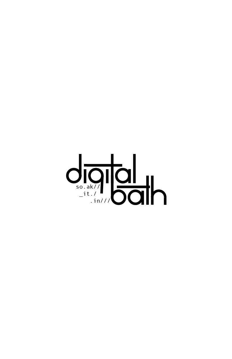
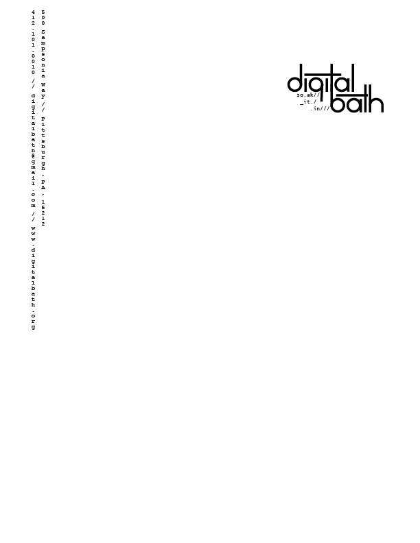
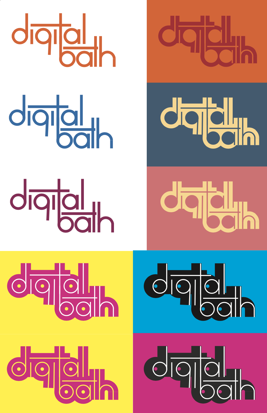
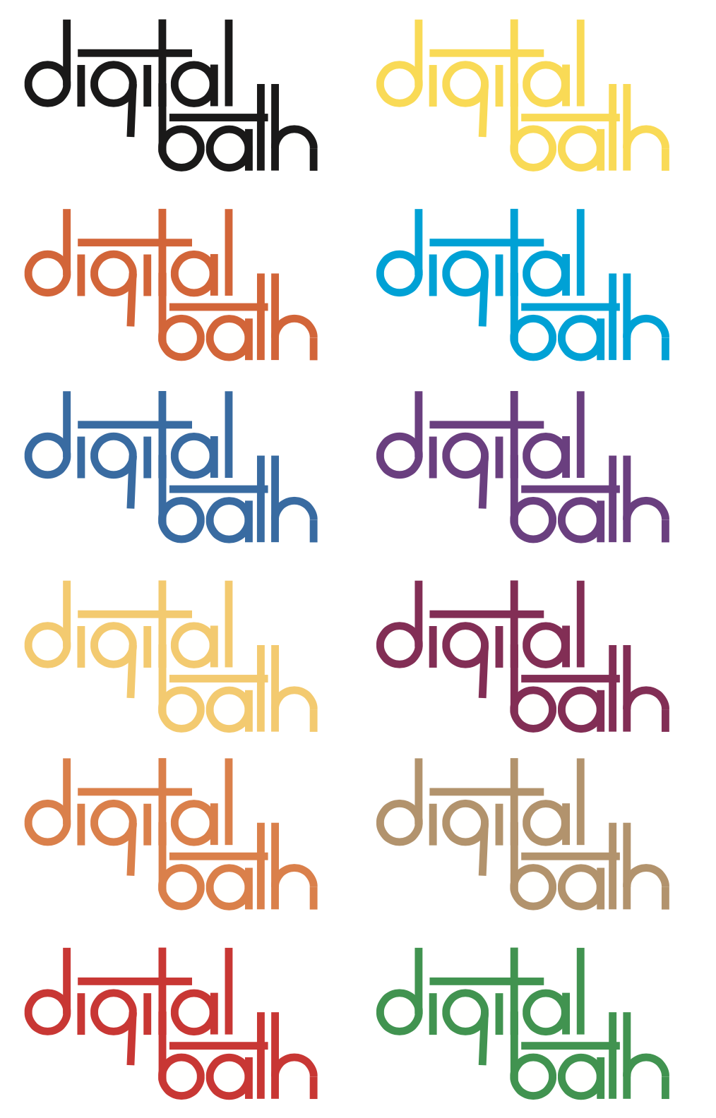
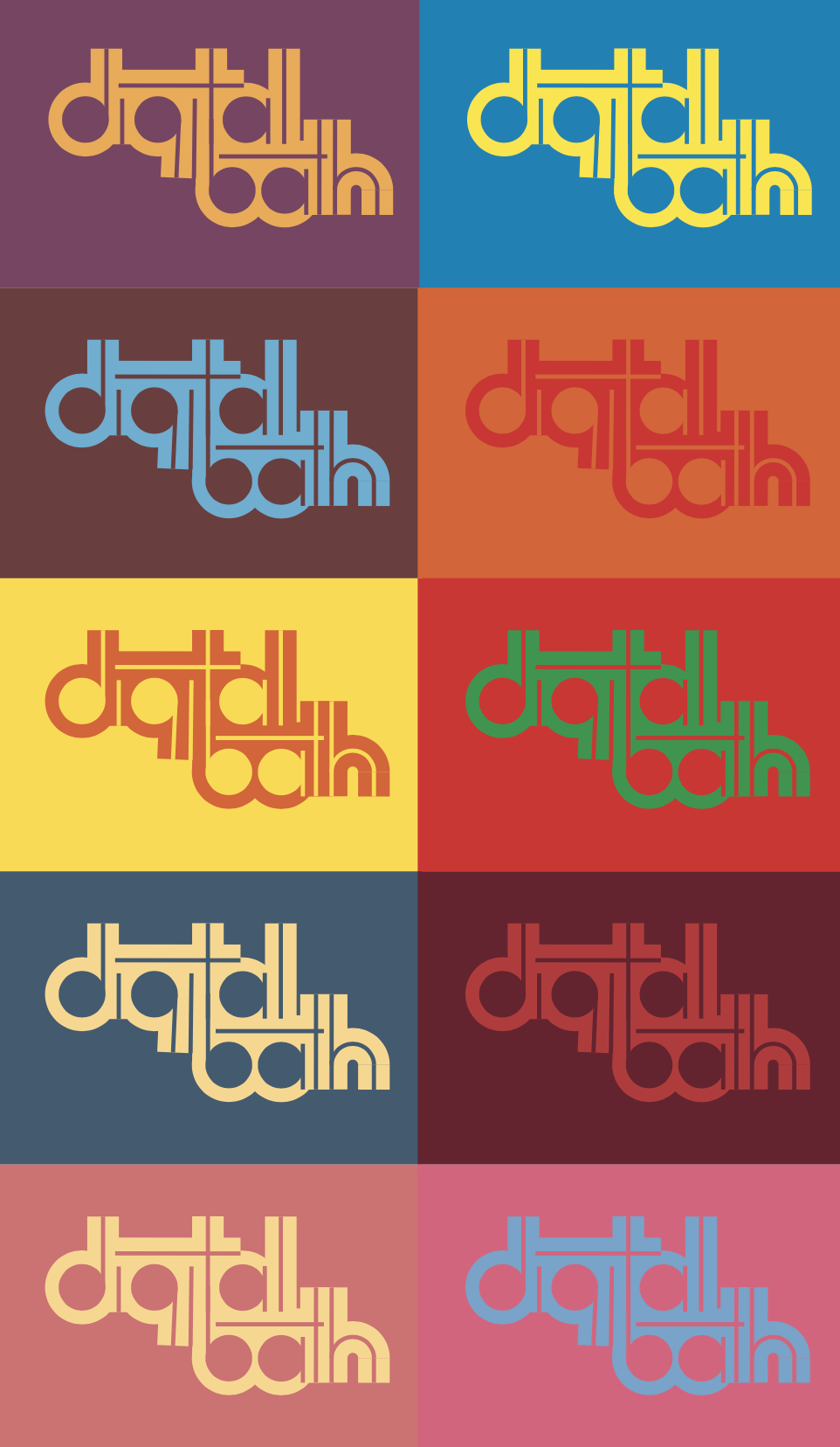
In order to establish an identity for Digital Bath. I would need to develop a branding system and collateral. I wanted to have a very delicate and balanced look to the logo, and I wanted to make sure it was formal. This ultimately helped the project with the contrast I strived for with the ties to a modern museum look. I developed a logo made from a simple sans serif face with rounded counters. I liked how it looked, but it was still missing that chic modernism look I wanted to strive for. I rebuilt the typeface to flow and intertwine between each letter. This process also created negative space, which gave this logo that cutting edge look. The kerning has room for each letter to breathe, giving it almost a monospaced look to resemble a computer code look. That monospaced type is what tied it back to that 90’s brutalism without being too on the nose.
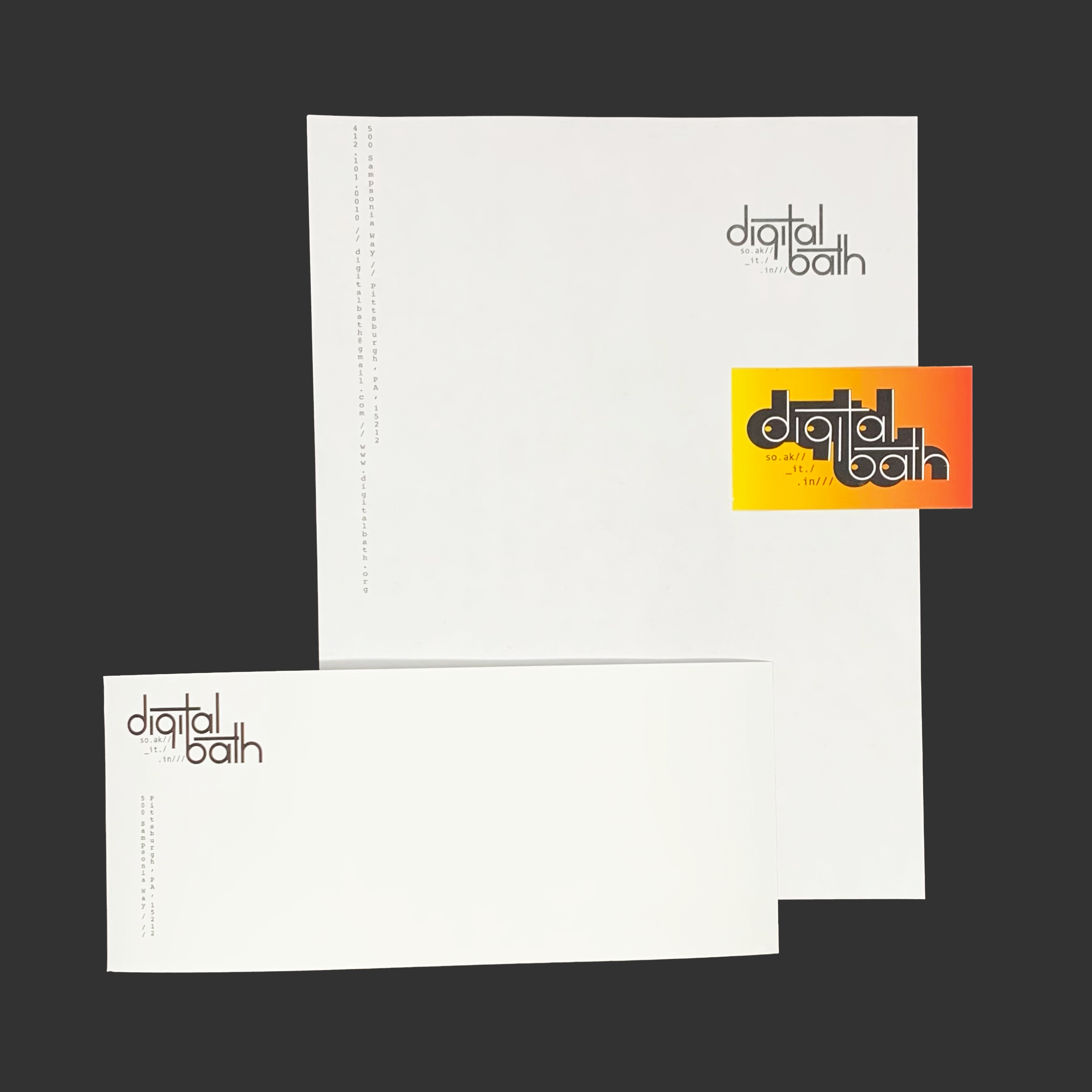
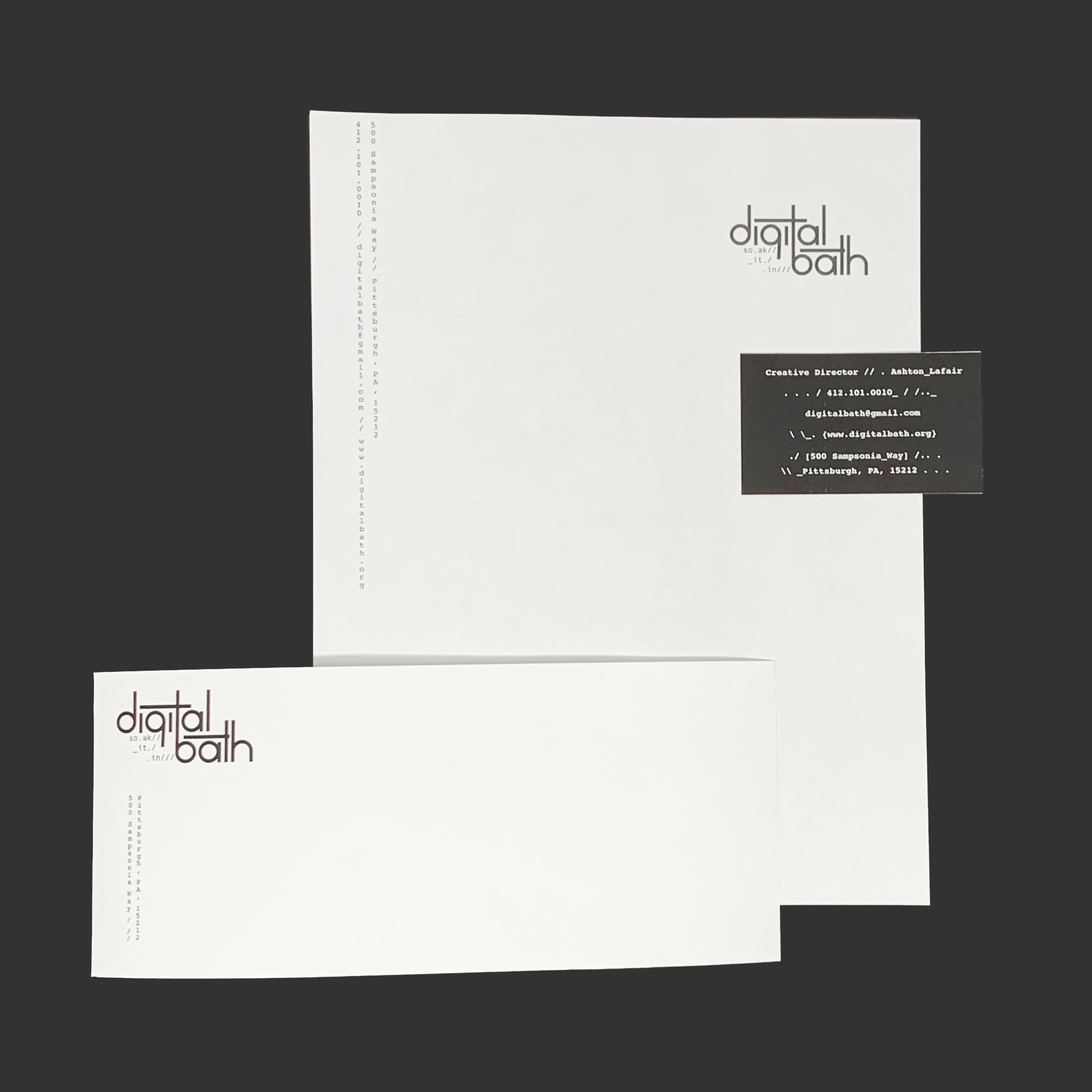
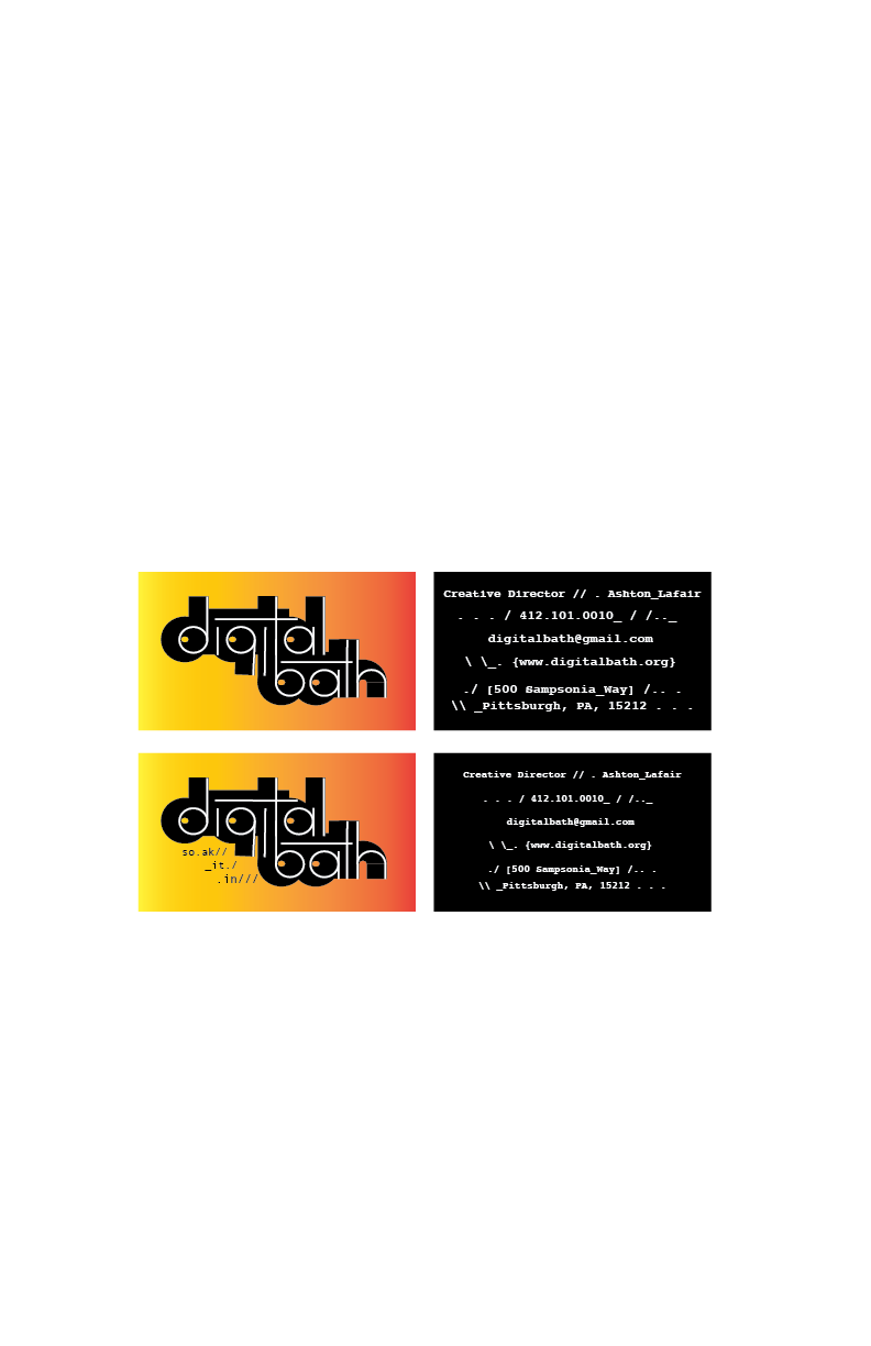
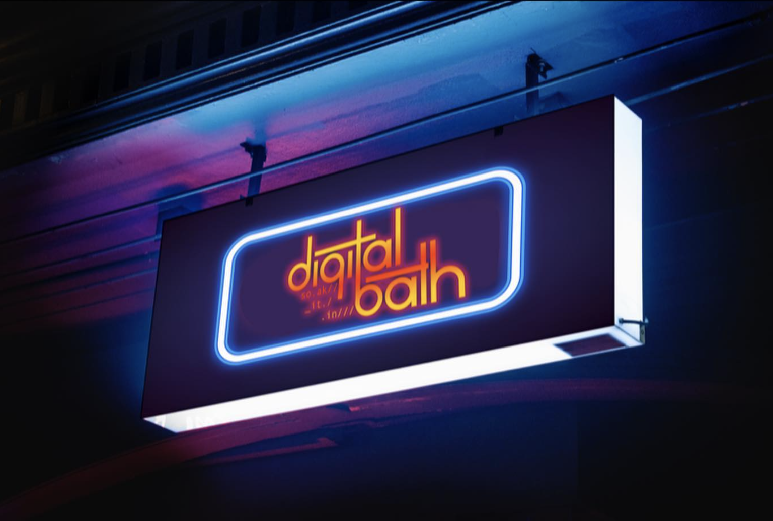
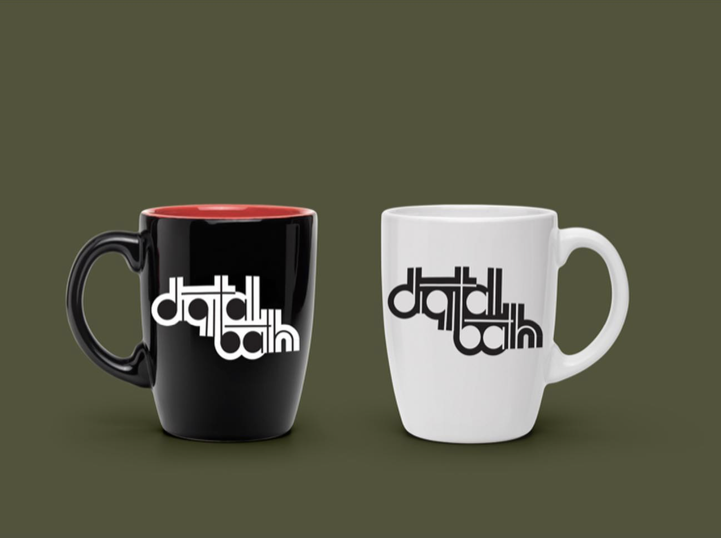
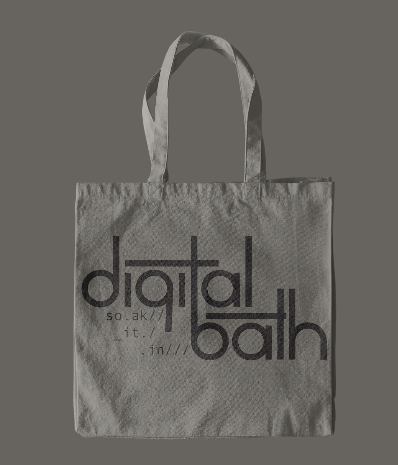
I wanted to keep this sleek, balanced look for the rest of the assets. This logo was the base, and there were a few other renditions. They all have their unique looks while remaining cohesive at their core. The different variations brought a breath to the logo and allowed for various applications. For example, the tote bag differs from the coffee mug. As for other logo applications, I brought it onto the business card with the drop shadow and a monospaced typeface that once again gave it that digital/coding look. The emulation of the brutalism on the business cards works super well without being over the top and tacky like the original movement was. The deliverables have an avant-garde look to the addresses on both the letterhead and envelope where they communicate to one another. These components communicate with that same metropolitan take on 90’s brutalism. When it came to the collateral, I put the reversed-out logo onto two black and white mugs. I also kept a modern look to the tote bag and put the base logo on it. I wanted that piece to show the clean and contemporary museum look that you see in every museum. The sign that I mocked up had a very modern LED look with a gradient to call back to the 90s.
The outcome of this project was successful due to the wide variety of mediums and styles while remaining true to the brand. I was able to achieve the balance and contrast that I imagined in the conceptual phase of this work. All of the pieces achieve the cohesion to create the brand that I had envisioned. I was able to bring this to a close by creating a brand that has a great sense of communication and clear direction choice.