Eaux Claires Festival
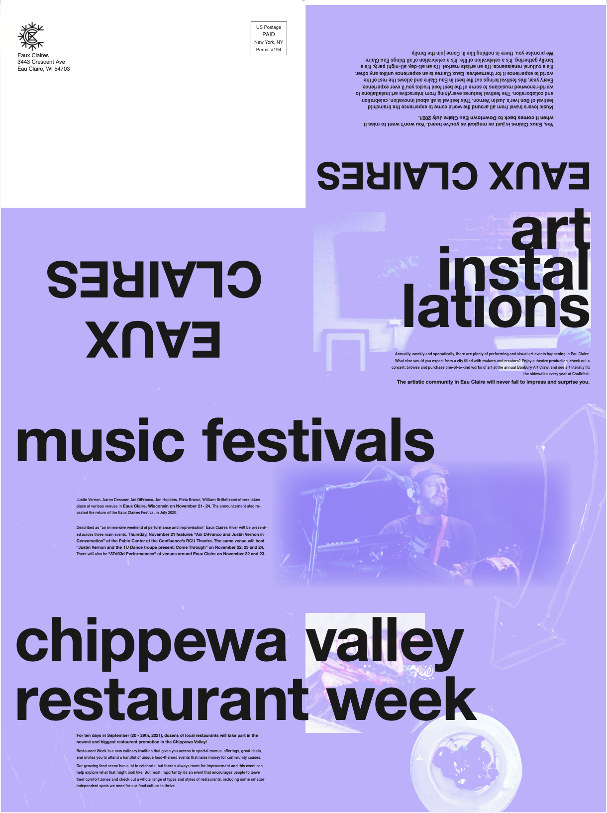
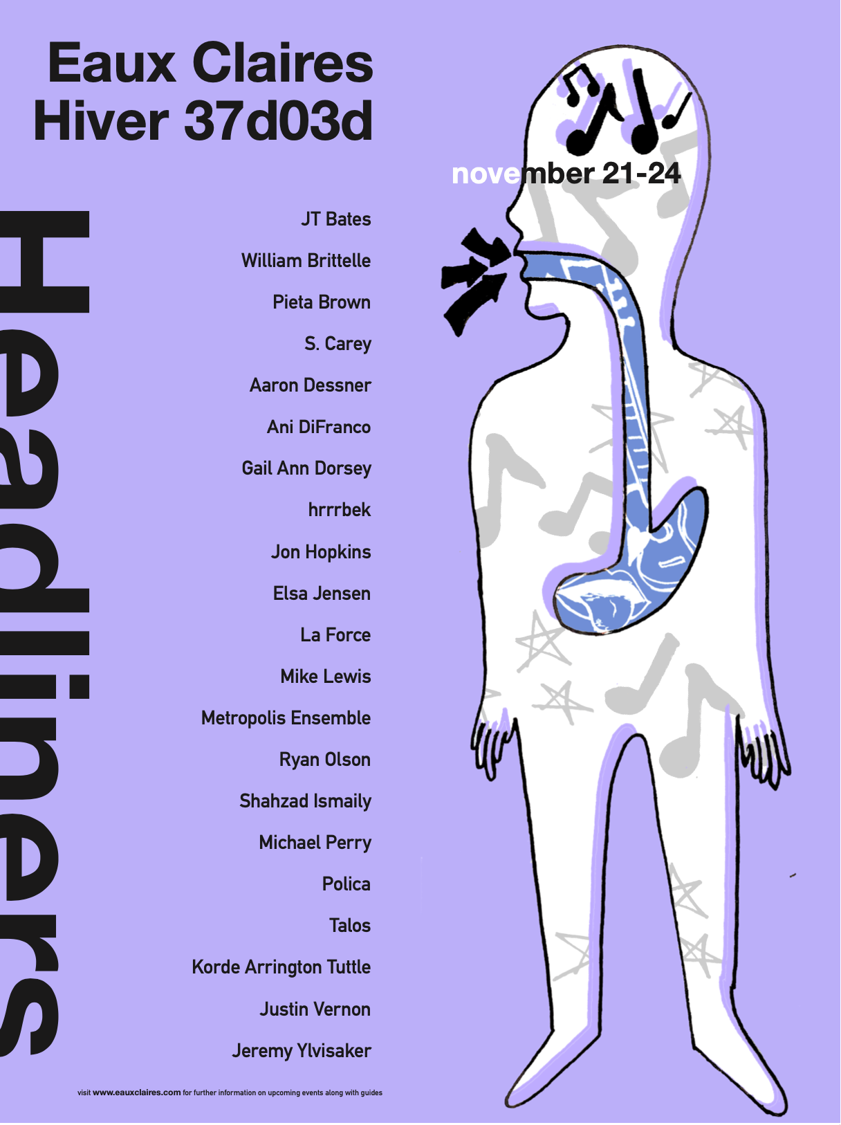
Since you will be there for a few days, you ask yourself what else you are going to do outside of the festival. The mailer points you in the right direction between museums and food. Outside of the contents, though, you see the design of the mailer, and it makes you feel in place with the lineup. This physical piece reflects the aesthetic of the festival you saw online, and now you get to hold onto a part of it for good. If the information wasn’t enough for you to hold onto it, though, it does have a full poster on the backside with the contents of the festival with the lineup, date, and even a piece of art. Now you’re ready for this show. This mailer really ties into the look and feel that Eaux Claires has with similar design choices that reflect the artists on the lineup as well as the festival itself.
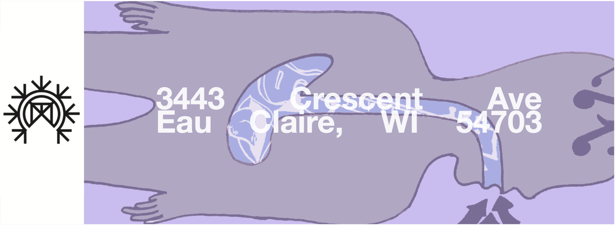
The initial challenge of this project was the layout of the mailer and creating an overall aesthetic that matched the previous lineups and festivals to keep cohesion to the brand. The overall aesthetic of previous lineups and years was to have heavy sans serif typefaces backed by a solid color and abstract imagery. They use a lot of illustration around the event rather than pictures of artists but if they do use pictures of the artists, then it is edited with transparency or black and white that gives them some extra attention. The lineups have been consistent with the subgenre of a folk styled alternative that pushes the boundaries of music. The majority of these artists all share the same style of music as well as aesthetic to an extent. Over the years, these lineups remain in the same pattern of similarity which allows the Eaux Claires designs to remain free to their choice.
Starting out, I researched the bands in the lineup and the Eaux Claire website and took note of the minimalism and color blocking they have done. During this step, I managed to settle on a bold sans serif font and the color block to reflect the festival and the lineup’s overall aesthetic. I wanted to keep the festival's aesthetic for this project while putting my spin on it to push their digital appearance in a physical form.
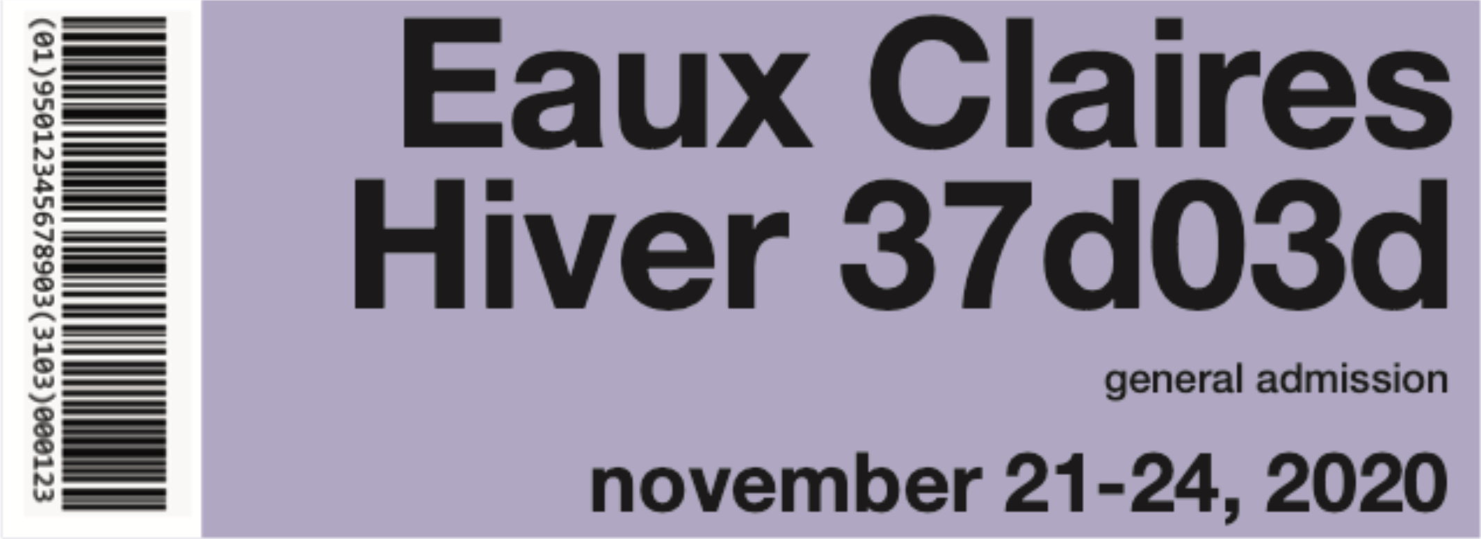
I achieved a sense of cohesion with this piece by making it reflect something that would be done with their brand. I was able to achieve the look and feel that is used for the festival by taking certain aspects from previous years. The large bold type does a great job at creating a consistent hierarchy. Lastly, the overlaid imagery does a great job of creating a directional look that guides throughout the poster. I would like to do this style more. I learned how dimensional a mailer can be. I think this piece is bold and eye-catching and would spark excitement for this festival. The ticket that came with the mailer also communicates to the main poster and has the illustration from the back of the mailer itself.